SERVICES
Brand Identity
UI/UX
Advertisements
Print Content
UI/UX
Advertisements
Print Content
THE BRIEF
Redesign 5 pages to give the app a fresh look without losing the essence that users are used to looking at. All of the designs stayed within the company's own branding guidelines, including colour. The design for the interface is meant to give the app a cleaner and more sophisticated feel that is still sports-like in nature.
DESIGN OUTCOMES
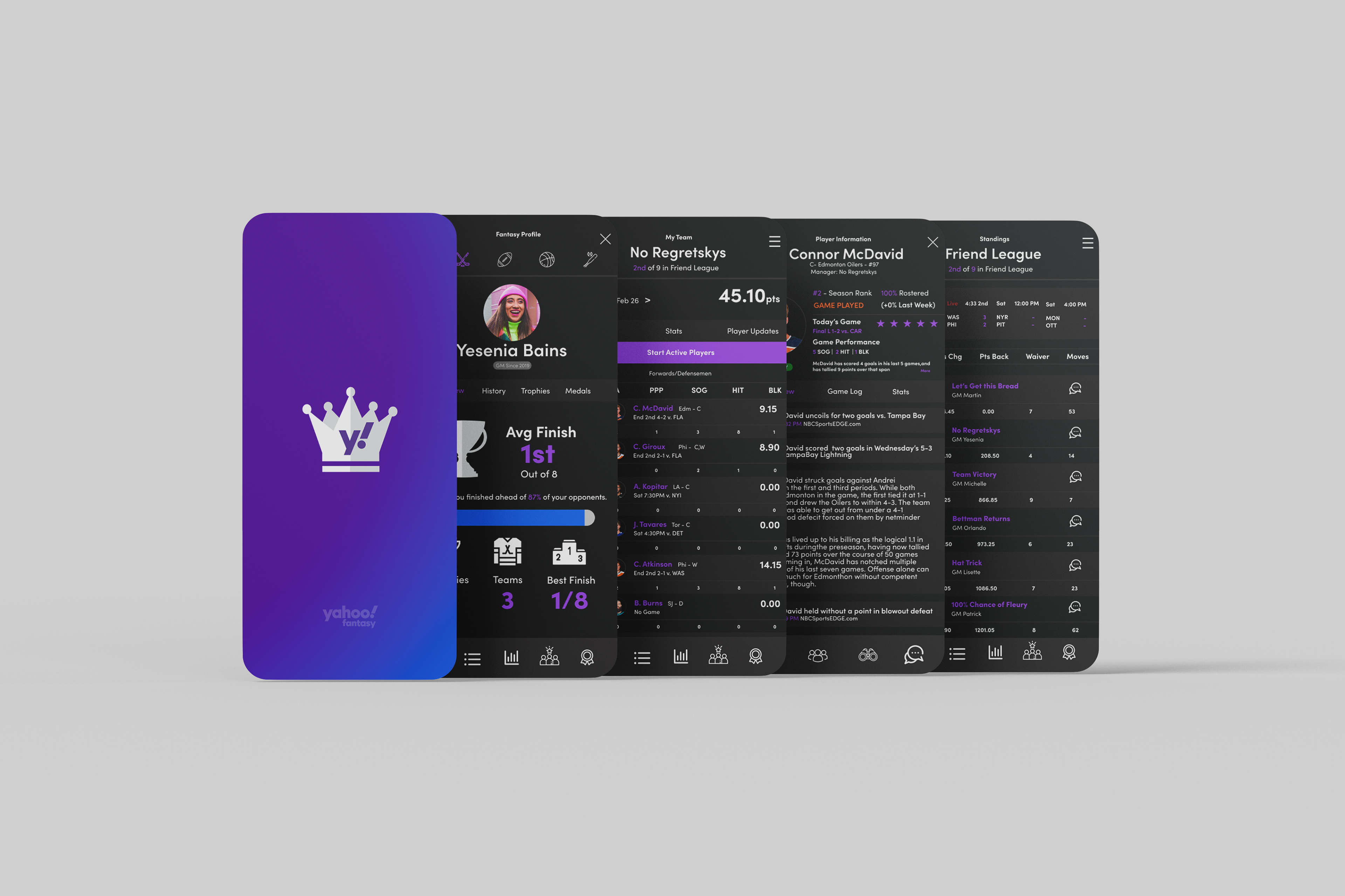
The design process for this began with an in-depth analysis of the current app. Once the key elements were identified, I began by sketching out 10 low fidelity sketches by hand to figure out the layout. With an idea of the layout sketched out, I then used Figma to put the layout together. The app itself has many screens and so the challenge was picking five screens that needed the most help. I also chose a font that would read clearer not only to refresh the look and feel but to help make reading it more accessible.
Old
Updated
App Splash Screen
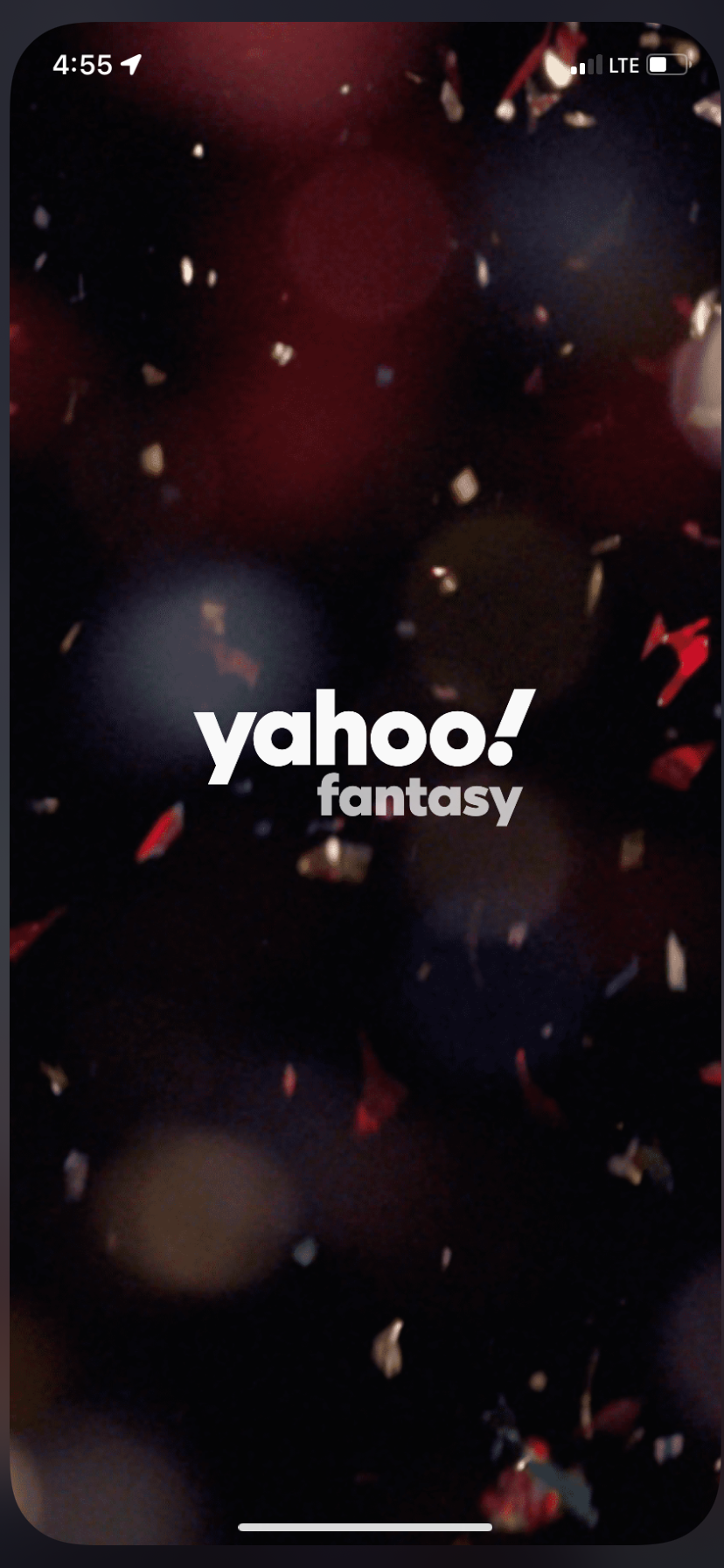
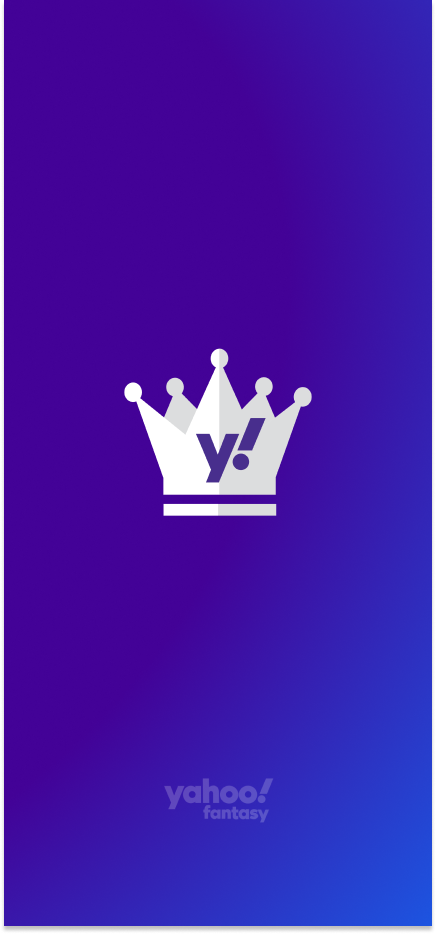
The startup screen is the first screen a user sees and the idea here was to create a screen that would look sophisticated and provide a more serious aura than what the current screen projects. I added new ideation of the logo, and changed the background to something solid, as the confetti isn't always easy to identify as confetti.
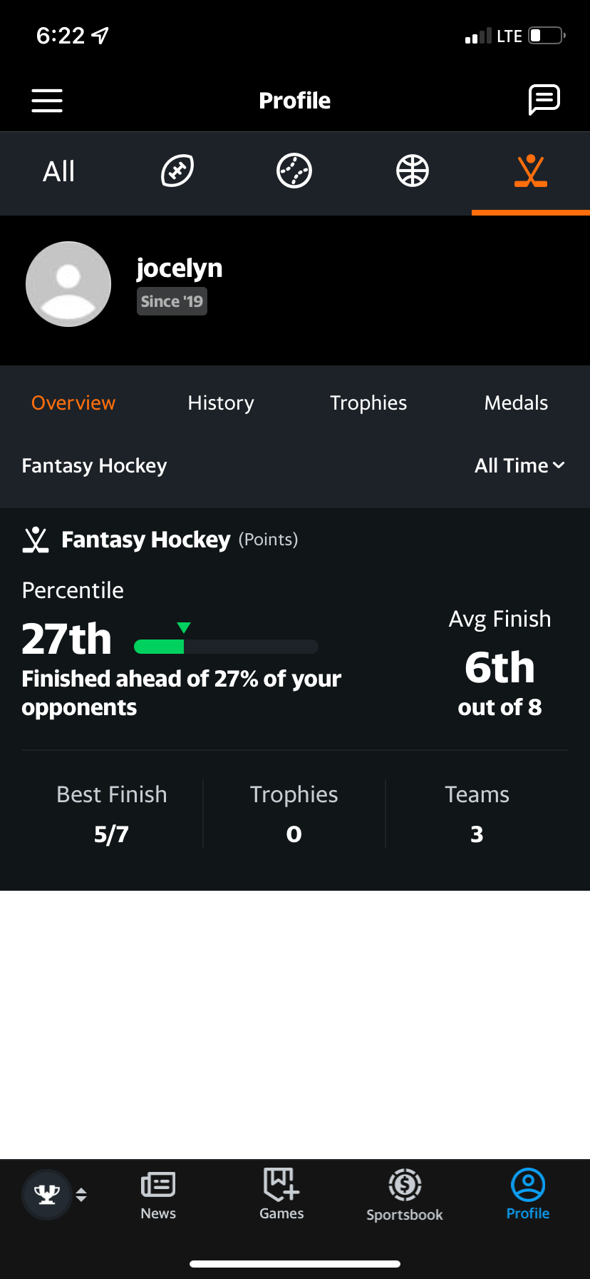
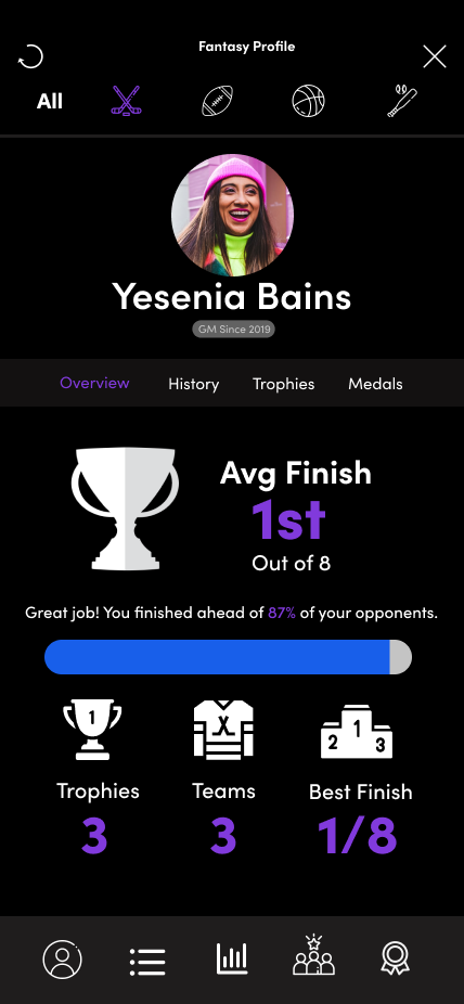
Profile page
The profile page was a page that lacked a bit of organization and focus on the key elements a user looks for when they click on their profile. On the new screen, there is more focus on the statistics with graphics that are easily identified, which helps users see those stats easily. The photo and name on the old screen were replaced with a larger profile photo and name, which gives the user of sense of importance rather than a second thought. There is also more colour used, which makes the numbers prominent and seen as soon as the user clicks on their profile.
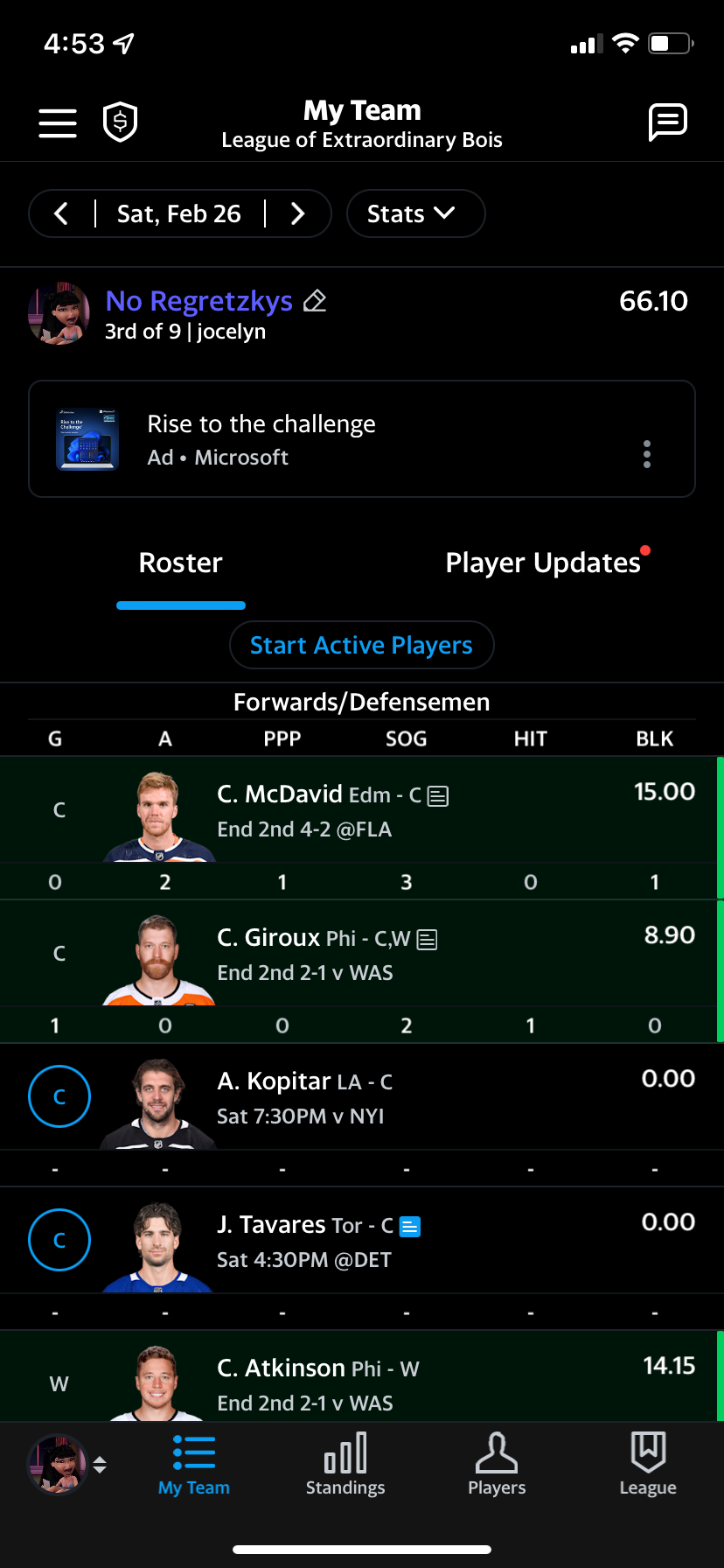
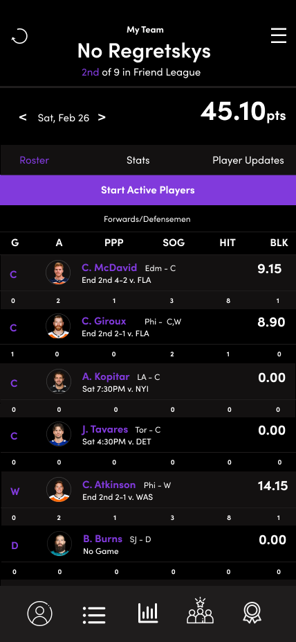
My team
The "My Team" page is currently a page that looks cluttered and full of text. To help make the screen more accessible, the font size was increased without compromising the space. The layout was designed to make use of all of the space in an efficient way (for example "Roster / Stats / Player Updates). Despite using a slightly larger font, the design enables elements such as the points to be a larger size, giving it the prominence it has on the screen. I also added colours to further refresh the page, and continue to use the brand colours.
Player profiles
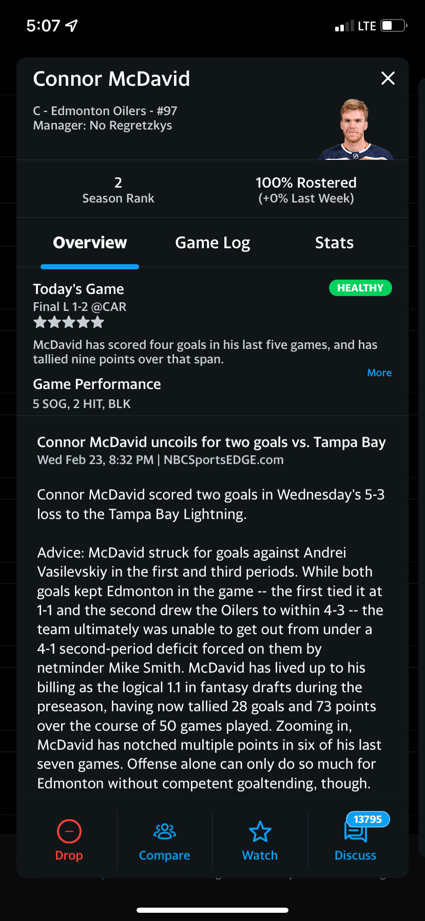
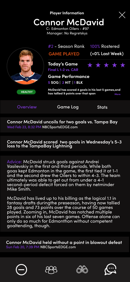
The player profiles screen is text-heavy and it was a challenge to provide a cleaner and spacious screen. To use the change the screen slightly, the player's photo was placed on the left and made bigger. On the right side of the photo, stats including games played, roster changes, games, and more were placed for easy access. This information is usually some of the most important for those who participate in fantasy leagues. Once again, a bit more colour was used to help refresh the look.
League standings
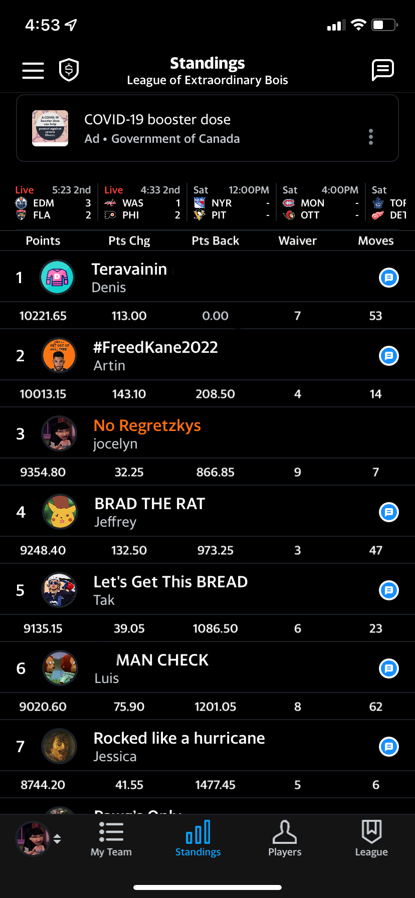
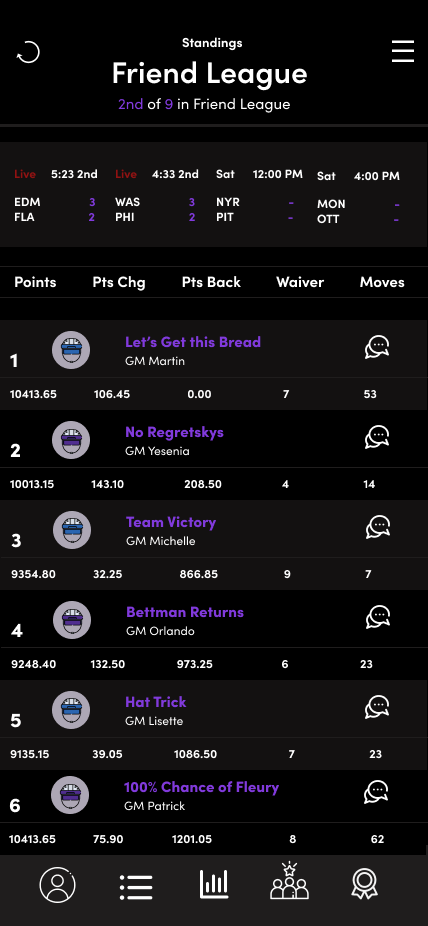
The league standings screen is probably one of the most viewed screens on the app because it shows users where they stand in the league. There is always a bit of personality from this page as players have the option to name their team, and add a profile picture. By nature, the page looks a bit cluttered and so the goal in the refresh was to make this page look organized without losing too much of the personality that comes from the players.
Designed using Adobe Photoshop, InDesign, and Figma
